Skip to content

Conversation

@robertalexa
Copy link
Contributor

Add support for an icon picker field. This took inspiration from https://github.com/hasinhayder/vue3-icon-picker but was modified greatly in the end.

image
image

Offers support for extending the fonts library dynamically.

A few notes:

  • json will be added to the page multiple time if more than 1 icon picker is included.
  • there are significant issues with how we handle font awesome 6, 4 (-o), wn- and icon-. We seems to be on FA 6.1.1 with the latest being 6.2.0. An update to this would be required, and maybe at this point re-work how we provide support for all the legacy, so that is also becomes easier to update and maintain.
  • because of the above, and because i do not know what FA was used in the forked repo, I am not sure if the icon picker as it stands in this PR covers all the icons in 6.1.1. This should be improved on upon updating FA

@robertalexa robertalexa marked this pull request as draft October 5, 2022 16:23
@bennothommo
Copy link
Member

@robertalexa this looks awesome. Do you have any screenshots on how this looks in the current backend theme?

As for upgrading Font Awesome, our current fork is using FA 6.1.1 as I made the upgrade in May. There was a manual element to it - I tried to use the LESS edition of the Font Awesome source files, but I believe I had to make substantial edits for us to cover all our legacy bases. If we need to upgrade again, I can have another crack at doing it and either make it more automated or at least document what I did.

@LukeTowers LukeTowers added enhancement PRs that implement a new feature or substantial change Status: In Progress labels Oct 24, 2022
@LukeTowers LukeTowers added this to the v1.2.2 milestone Oct 24, 2022
@robertalexa
Copy link
Contributor Author

@bennothommo The picker looks the same on both default and tailwindui theme.

I had an attempt and thought that it would be great to instead use a variable (the branding colours that the user selects) but I have discovered inconsistencies between the use of those brandings between the default and tailwindui theme. So i have left this for now.

The light blue looks like it belongs on both UIs
image

@robertalexa robertalexa marked this pull request as ready for review November 1, 2022 15:12
@jaxwilko
Copy link
Member

jaxwilko commented Dec 5, 2022

@LukeTowers any news on this?

@LukeTowers
Copy link
Member

@jaxwilko it needs to be loaded from a YAML file like a nestedform form config instead of a config file. I can do that sometime this week if @robertalexa can't.

@robertalexa
Copy link
Contributor Author

@LukeTowers What difference does that make if neither of these options is the real good long term one? The real good one is to actually handle this "library" of icons as part of the update process of fontawesome at winter's end and decomissions the hardcoded config/yaml approach.

But to do it the right way now, it requires font awesome updated, the shims done once, in 1 place, and married with an existing FA, with regular, solid and brands categories in mind, and with the update process defined and documented.

@LukeTowers
Copy link
Member

Regardless of the long term improvements to the icon updating process for the Winter core the API for this particular form widget will remain the same:

icon:
    label: Icon
    type: iconpicker
    libraries: 
        fontawesome: ...
        materialui: ...
    # or
    libraries: ~/modules/backend/formwidgets/iconpicker/meta/libraries.yaml

It will not be a config file at any point.

Another change that needs to be made is renaming
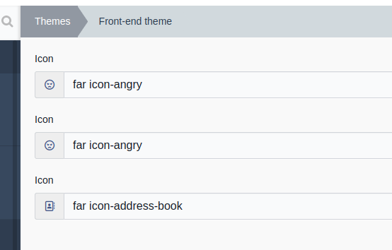
 app.js to iconpicker.js and App.vue to IconPicker.vue and let app = createApp(App) to let iconPicker = createApp(IconPicker)

@robertalexa
Copy link
Contributor Author

robertalexa commented Dec 6, 2022

form:
    fields:
        icon:
            label: 'Icon'
            type: 'iconpicker'
            default: 'far icon-angry'
            libraries:
                -
                    id: 'far'
                    title: "Font Awesome Regular"
                    prefix: "far icon-"
                    listicon: "far icon-circle"
                    icons:
                        - "far icon-address-book"
                        - "far icon-address-card"
        icon2:
            label: 'Icon'
            type: 'iconpicker'
            default: 'far icon-angry'
            libraries: ~/modules/backend/formwidgets/iconpicker/meta/libraries.yaml
        icon3:
            label: 'Icon'
            type: 'iconpicker'

Use the above to test. These are the current variations supported using the approach suggested by @LukeTowers

NOTE: the libraries are not scoped by a library parent. They share equal weight. In the context of FontAwesome; far, fas and fab are "individual" libraries

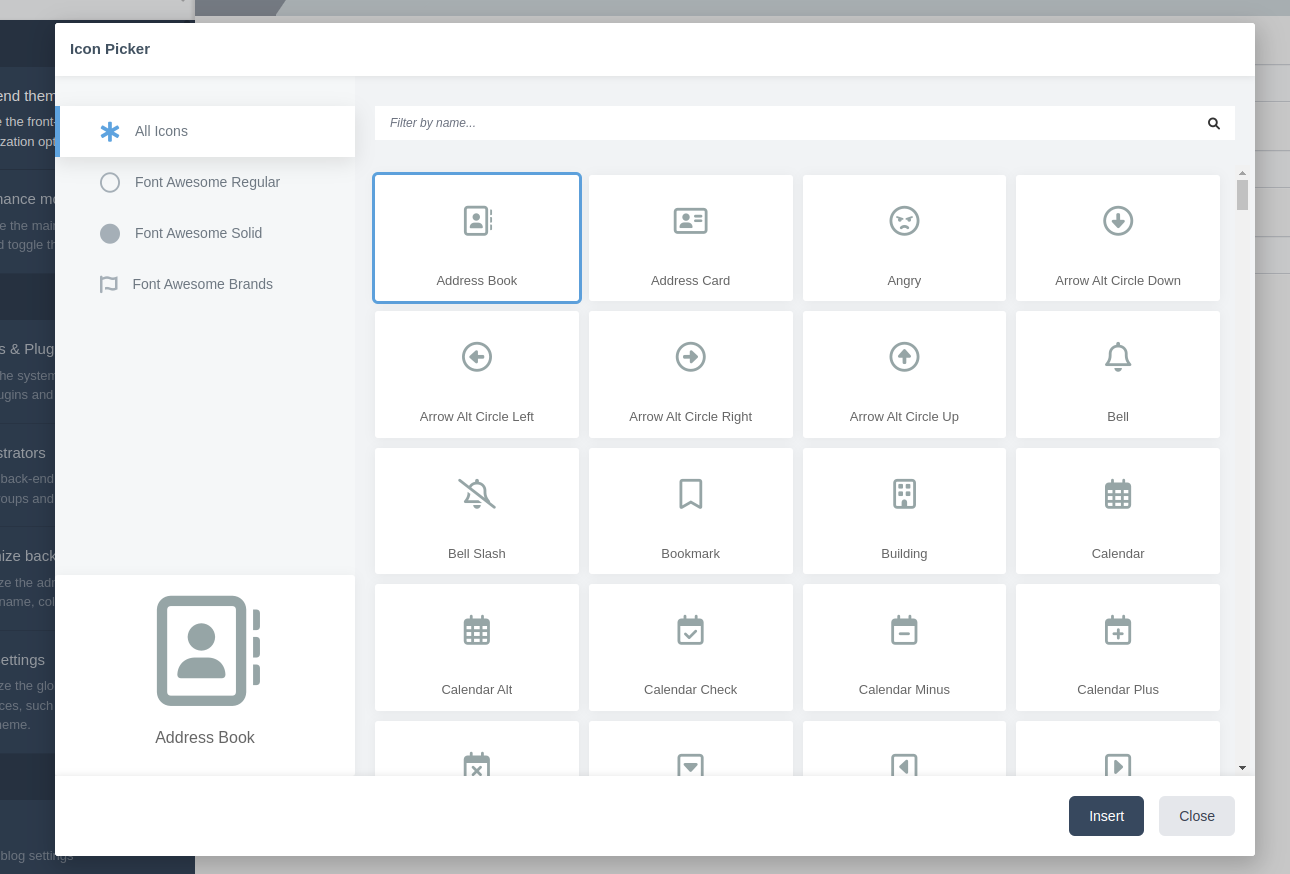
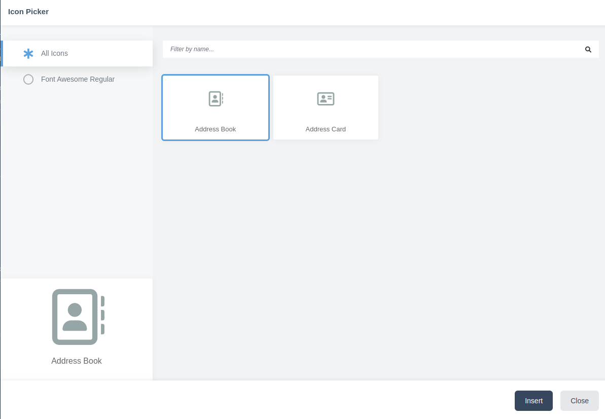
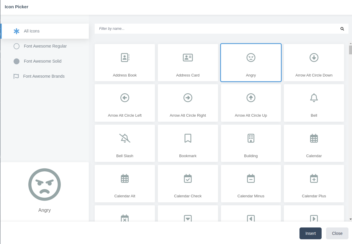
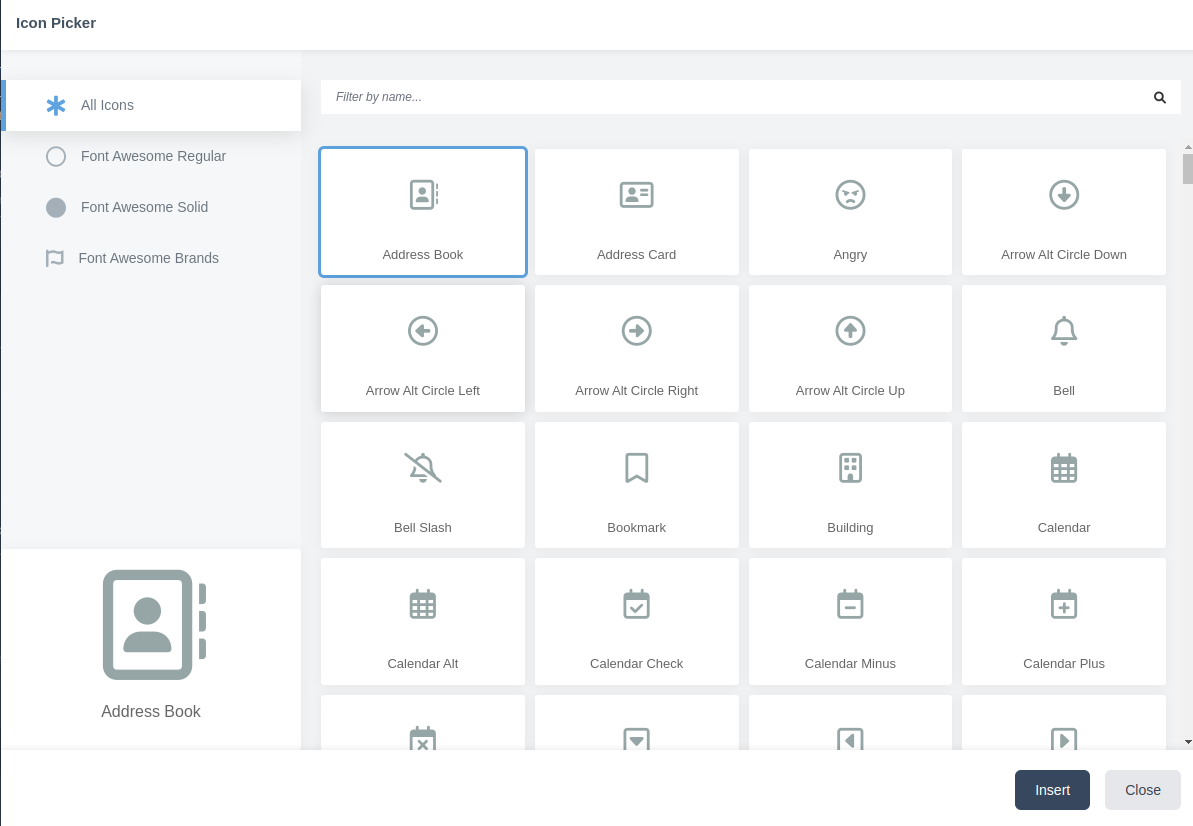
The above example shows:

  • manual library definition
  • file based library
  • no library defined - it will then default to the default path in \Backend\FormWidgets\IconPicker::DEFAULT_LIBRARIES
  • no default icon defined - it will then default to 1st available icon
  • default icon defined but not available in the library - defaults to 1st available icon

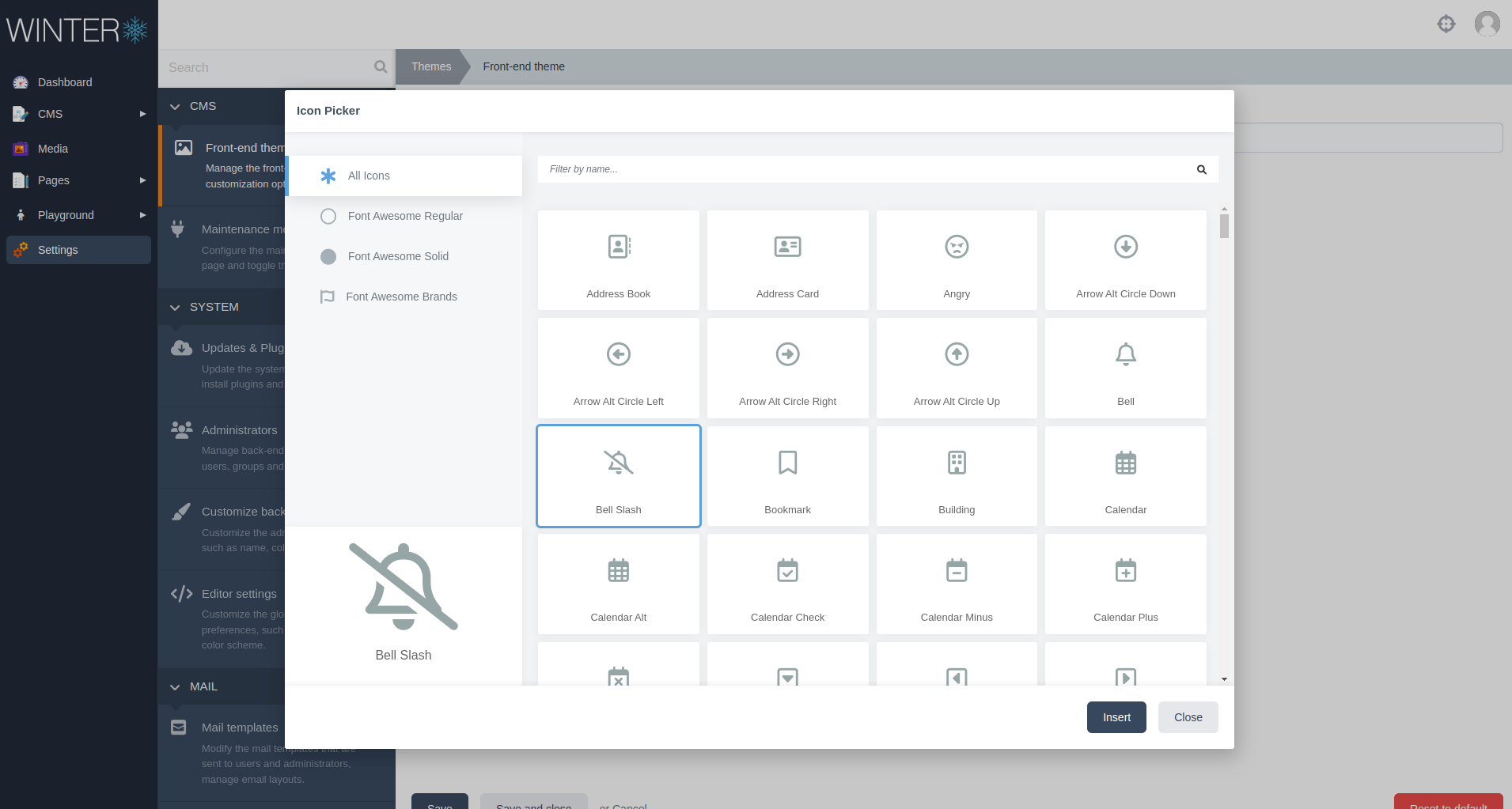
In the grand scheme of things, the libraries.yaml file should be rebuild as part of FA update process. I can't guarantee that the current list contains all the icons available in the current (winter) FA version, but I can guarantee that everything that is included is 100% supported.

Screeshots in the order of the above example:
image

image

image

image

@LukeTowers
Copy link
Member

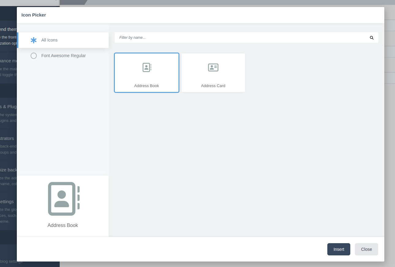
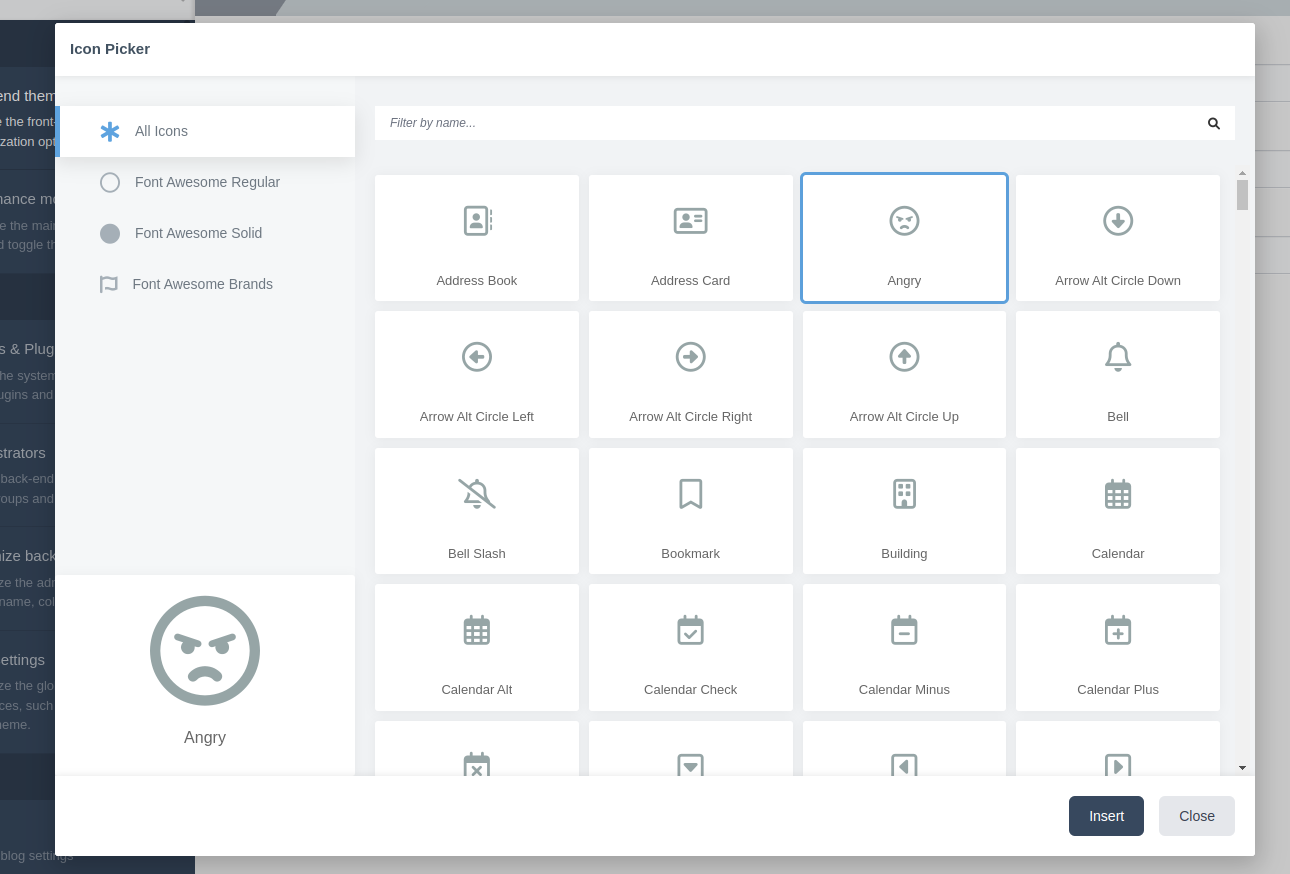
Looking amazing so far @robertalexa!

Just the few items remaining:

  • Need to compile the assets for production

no default icon defined - it will then default to 1st available icon
default icon defined but not available in the library - defaults to 1st available icon

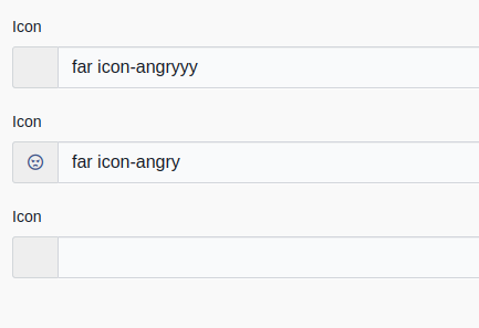
This widget should at its core act like an enhanced text input. If a value is present that is not defined in the configured library then it should still load, display, and persist that value as if it was a regular text box, but it will just not show any icon preview. With that in mind, the behaviour for those two cases should be as follows:

  • No default icon defined and/or no existing value - text input is empty
  • Default icon defined and/or existing value but value is not available in the library - text input contains the value, the preview does not display it.

@robertalexa
Copy link
Contributor Author

@LukeTowers I have implemented changes based on your feedback.

    fields:
        icon:
            label: 'Icon'
            type: 'iconpicker'
            default: 'far icon-angryyy'
            libraries:
                -
                    id: 'far'
                    title: "Font Awesome Regular"
                    prefix: "far icon-"
                    listicon: "far icon-circle"
                    icons:
                        - "far icon-address-book"
                        - "far icon-address-card"
        icon2:
            label: 'Icon'
            type: 'iconpicker'
            default: 'far icon-angry'
            libraries: ~/modules/backend/formwidgets/iconpicker/meta/libraries.yaml
        icon3:
            label: 'Icon'
            type: 'iconpicker'

image

First icon picker open (no value, set default, unavailable in the library):
image

Second icon picker open (no value, set default, available in the library)
image

Third icon picker open (no value, no set default, first icon in library)
image

@LukeTowers LukeTowers merged commit 34d13ca into wintercms:develop Dec 8, 2022
@LukeTowers
Copy link
Member

Awesome work @robertalexa, thanks! Could you put together a PR to the docs to document it?

LukeTowers added a commit that referenced this pull request Dec 8, 2022
* develop:
  Fix issue with autoloading modules (#792)
  Add support for icon picker (#725)
  Classloader improvements (#779)
  Update Markdown content test
  Improved Ukrainian translation (#766)
  Add AJAX form validation to Snowboard (#777)
  Improve theme scaffolding (#778)
Sign up for free to join this conversation on GitHub. Already have an account? Sign in to comment

Labels

enhancement PRs that implement a new feature or substantial change

Projects

Status: Done

Development

Successfully merging this pull request may close these issues.

4 participants