feat(SearchInput): new expandable button for masthead variant#7903
feat(SearchInput): new expandable button for masthead variant#7903tlabaj merged 13 commits intopatternfly:mainfrom
Conversation
|
Preview: https://patternfly-react-pr-7903.surge.sh A11y report: https://patternfly-react-pr-7903-a11y.surge.sh |
 nicolethoen
left a comment
nicolethoen
left a comment
There was a problem hiding this comment.
@mcarrano Should we add a new masthead demo to include this search input feature as past of this issue? Or is there a follow up issue?
Also, @mmenestr or @mcarrano, I feel like it looks a little strange once I start typing in the search input because there are two close buttons next to each other - one for clearing the input and one for collapsing the search. Is that something we considered?
|
|
||
| const expandedLabel = () => { | ||
| if (isExpanded) { | ||
| return 'Close'; |
There was a problem hiding this comment.
These need to be something the consumer can override - consider internationalization where people need to be able to translate their sites into different languages.
There was a problem hiding this comment.
Going off of Nicole's comment above, the default value for the "close" button could be more similar to button in the collapsed state, e.g. "Close search".
Though because this is something that can collapse/expand, I'm thinking an alternative would be to omit an aria-label that includes the state (though not getting rid of it entirely), and just use aria-expanded on the button to announce the expanded state.
Going that route would still allow a consumer to pass in an aria-label to this button via a new prop, then aria-expanded can be set based on the isExpanded prop. @nicolethoen wdyt?
There was a problem hiding this comment.
+1 about aria-expanded with a separate ariaLabel type prop.
Small nit is that I would prefer this to not be a function (an inline if block should work the same), but either way.
| if (!!onSearch || attributes.length > 0 || !!onToggleAdvancedSearch) { | ||
| if (attributes.length > 0) { | ||
| const AdvancedSearch = ( | ||
| <span> |
There was a problem hiding this comment.
Is this code simply repeated from the code around lines 333? If so, we should avoid duplicate code as much as possible.
|
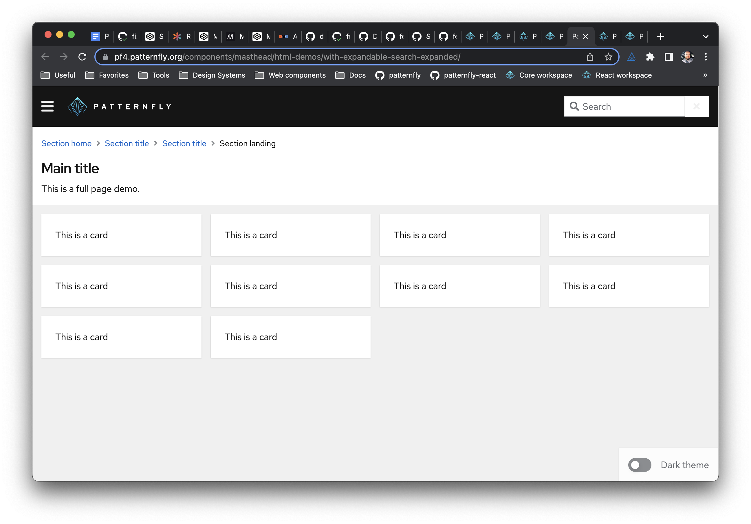
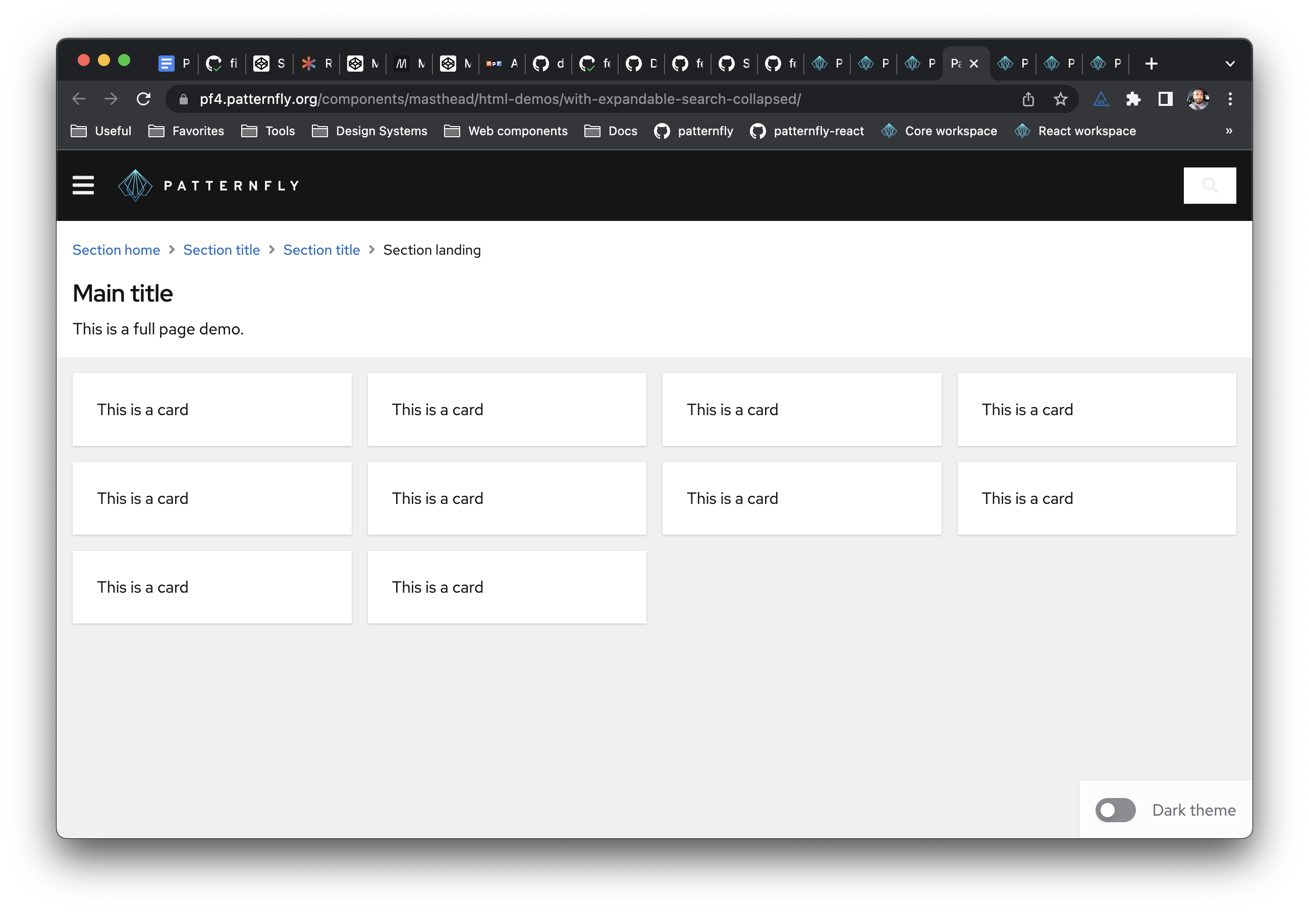
@andyyvo @nicolethoen Yes, I think it would be useful to add a demo and no, I didn't already open an issue for that. Regarding the two close/clear buttons, yes, I do think that was an oversight and we shouldn't have that. We basically want this to work like the search in the masthead on the PatternFly site. There, the field does not have a separate clear, but collapsing the field also clears the field. Could this be made to work that way? Finally comment/question. I found it a bit confusing that the example starts with the field expanded because it's not obvious how to expand it. Maybe start with the search field hidden? |
|
@mcarrano Should collapsing the search input also clear the input? so when it expands again, it's empty? |
Yes, I think so. |
| const [searchValue, setSearchValue] = React.useState(value); | ||
| const searchInputRef = React.useRef(null); | ||
| const searchInputInputRef = innerRef || React.useRef(null); | ||
| const [isSearchInputExpanded, setIsSearchInputExpanded] = React.useState(true); |
There was a problem hiding this comment.
Could we omit this state entirely and base logic elsewhere off of the isExpanded prop? It doesn't seem like it's entirely needed since consumers will have to pass in both the isExpanded and onToggleExpand props to control the expanding functionality.
There was a problem hiding this comment.
I think it could be removed. The state could be used to enable uncontrolled expansion, but as is it doesn't appear to work after playing with the example (onToggleExpand is required to turn the input into an expandable variant, and removing isExpanded prevents expansion entirely).
There was a problem hiding this comment.
if we are going the support uncontrolled, I would update the comment to mention that.
|
|
||
| const expandedLabel = () => { | ||
| if (isExpanded) { | ||
| return 'Close'; |
There was a problem hiding this comment.
Going off of Nicole's comment above, the default value for the "close" button could be more similar to button in the collapsed state, e.g. "Close search".
Though because this is something that can collapse/expand, I'm thinking an alternative would be to omit an aria-label that includes the state (though not getting rid of it entirely), and just use aria-expanded on the button to announce the expanded state.
Going that route would still allow a consumer to pass in an aria-label to this button via a new prop, then aria-expanded can be set based on the isExpanded prop. @nicolethoen wdyt?
|
|
||
| export const SearchInputWithExpandable: React.FunctionComponent = () => { | ||
| const [value, setValue] = React.useState(''); | ||
| const [isExpanded, setIsExpanded] = React.useState(true); |
There was a problem hiding this comment.
Similar to what @mcarrano said, I'd opt to have this false by default
 mcoker
left a comment
mcoker
left a comment
There was a problem hiding this comment.
LGTM! If you're going to add a demo in the masthead, part of the core PR adds a .pf-m-plain variation to the input group that removes the white background for use against a non-white background, otherwise it will look like this:
|
I'm buttoning this work up now, as far as the API goes do you all have any thoughts on having separate props for isExpanded, onToggleExpanded, and a new aria label prop for the toggle vs combining all those props into a single object prop? @tlabaj @thatblindgeye @nicolethoen @kmcfaul |
|
I like them combined into a single, well documented prop - especially if we expect people to need to use more than one at a time to implement the feature. |
|
Agreed with Nicole's comment. It maaaay also differentiate those props a little more from some other props (aria-label, onToggleAdvancedSearch) |
|
I like the idea of grouping props together that otherwise do not make sense on there own like in this case. |
 thatblindgeye
left a comment
thatblindgeye
left a comment
There was a problem hiding this comment.
Had a few comments below, two related to the a11y error that'll need an update, and one that's non-blocking/I can create a followup for
| value={value} | ||
| onChange={onChange} | ||
| onClear={() => onChange('')} | ||
| expandableProps={{ isExpanded, onToggleExpand }} |
There was a problem hiding this comment.
This needs the toggleAriaLabel prop passed in.
| const onExpandHandler = (event: React.SyntheticEvent<HTMLButtonElement>) => { | ||
| setSearchValue(''); | ||
| onToggleExpand(isExpanded, event); | ||
| }; |
There was a problem hiding this comment.
Not blocking and more of a followup issue since it'll depend whether the behavior should be built-in or just part of the example, but we should tidy up the focus management when the search input in the new example expands and collapses. Currently the behavior makes it difficult to know what has focus after interaction:
Expandable.search.input.focus.mov
| /** Callback function to toggle the expandable search input */ | ||
| onToggleExpand: (isExpanded: boolean, event: React.SyntheticEvent<HTMLButtonElement>) => void; | ||
| /** An accessible label for the expandable search input toggle */ | ||
| toggleAriaLabel?: string; |
There was a problem hiding this comment.
Because an a11y error will get flagged for the icon button not having an accessible name, we should make this a required prop as well.
thatblindgeye
left a comment
There was a problem hiding this comment.
🔥 Awesome job on this to both of you, @andyyvo and @wise-king-sullyman !
|
@mcarrano does the behavior in the example now line up with what you expected? Convenience link: https://patternfly-react-pr-7903.surge.sh/components/search-input#with-expandable-button |
 mcarrano
left a comment
mcarrano
left a comment
There was a problem hiding this comment.
@mcarrano does the behavior in the example now line up with what you expected?
Yes. This looks great. Thanks @andyyvo @wise-king-sullyman
| hint?: string; | ||
|
|
||
| /** Object that makes the search input expandable/collapsible */ | ||
| expandableProps?: expandableProps; |
There was a problem hiding this comment.
As discussed on slack. I change this prop name to not be suffixed with "Props".
 tlabaj
left a comment
tlabaj
left a comment
There was a problem hiding this comment.
LGTM. Thank you Andy and Austin.
|
Your changes have been released in:
Thanks for your contribution! 🎉 |
What: Closes #7380 . Introduced two new props
isExpandedandonToggleExpandinSearchInput.tsx. These new props allow the search input component to expand and collapse via a button. This wrapper can be found in thebuildSearchTextInputGroupWithExpandandbuildSearchTextInputGroupWithExtraButtonsAndExpandfunctions where the former adds the button to the basic search input and the latter adds the button to the search input with submit button. An example was created that demonstrates the use of a basic search input with the expand toggle button.Additional issues: Code regarding the advanced search is repeated. Writing it as a function messed up something about the state so it was simply copied twice.