chore(Card): Updated Card demos to use Select instead of Dropdown#6639
Conversation
 mcarrano
left a comment
mcarrano
left a comment
There was a problem hiding this comment.
This looks good @gabipodolnikova , but I just had one small request. Can we change the menu items in these filter select lists to be something more relevant. What about having, "Last hour," "Last 6 hours," "Last 24 hours," and "Last 7 days?" This will just emphasize that this is selection of options and not actions.
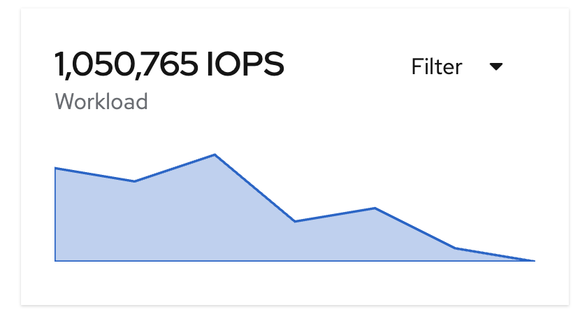
Also, I'm wondering why the plain select seems slightly misaligned with the card title. @mcoker can you check this? Is there a way to align these better?
Yes, will do that 👍
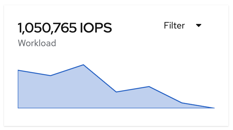
I also notice this, it is more visible with the plain variant, which in the HTML demos they are not plain. |
@mcarrano it's because the card title is designed to be 16px but we're using a large title variation in that card. If we're changing the title font size, I think it's expected you might need to change the action position to match. We could
wdyt? |
|
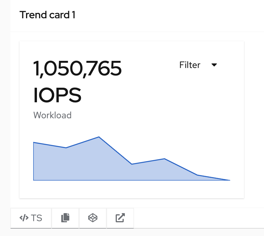
@gabipodolnikova @mcoker I don't want to reintroduce the borders to the select menus as we had previously determined that the plain Selects look best here. Perhaps we could reduce the card titles normal size. @mceledonia do you think that the titles need to be as large as they are? Or we could live with this... |
|
I am hesitant to lower the title size of these demos since the typographic hierarchy is really what makes them. In other words the whole point of these trend cards is to have nice big numbers you can easily see at a glance. What does using custom styling look like to make the adjustment in terms of best practice / cleanliness? |
|
@mceledonia custom styling would just be some sort of manual adjustment to the action position to match whatever font size was used for the card title. So you would push it down a bit. Also how do you think the action should align with the text? Right now the top of the title text is aligned with the top of the action text. That should scale regardless the font size used and number of lines in the title text since we don't have to know the card title font size to align it that way.
We have a modifier to use there with non-plain buttons that removes the offset we put in place to align the top of the action text with the top of the title. Here's what that looks like with this title
^ it looks pretty good, but that's also kind of coincidental since it's just removing the button offset. It wouldn't work, for example, with larger text.
Also just to confirm, the ideal alignment would be "baseline" where the bottom of the first line of title text is aligned with the bottom of the button text, as if they were on the same line? |
|
@mceledonia @mcarrano I've opened an issue here if we would like to explore this alignment some more in core - patternfly/patternfly#4553 |
 kmcfaul
left a comment
kmcfaul
left a comment
There was a problem hiding this comment.
LGTM on the react-side of things
mcarrano
left a comment
There was a problem hiding this comment.
Looks good @gabipodolnikova . We can address the alignment issue in a future milestone.
What: Closes #6560